1. Match the paper to the job length
Poster paper is not one single product. For a one day promotion, a training notice or a short retail run, a lighter coated sheet can do the work at good cost. For a display that stays up longer, choose a heavier poster stock with a coating that holds colour better and resists handling. In practice, the longer the poster must last, the more attention you need to give to weight, finish and drying time.
Indoor display is usually the target. That means you want clean text, solid colour blocks and a surface that does not show every fingerprint. In Cape Town, where offices and showrooms often have strong daylight, a matte or satin finish can help reduce glare from windows and overhead lights. For a busy reception or school corridor, that small choice makes the poster easier to read from a few metres away.
2. What printer type suits poster paper
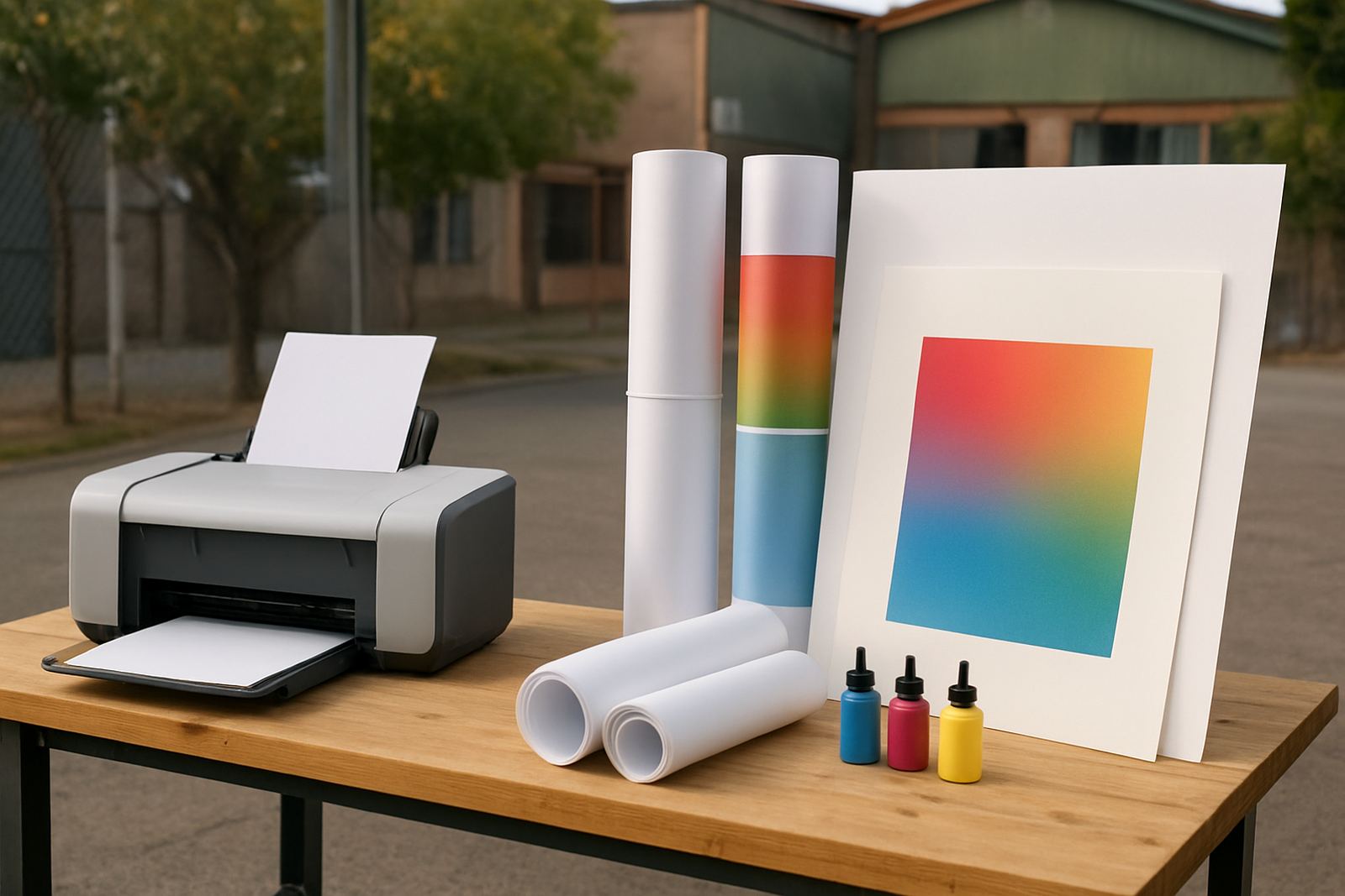
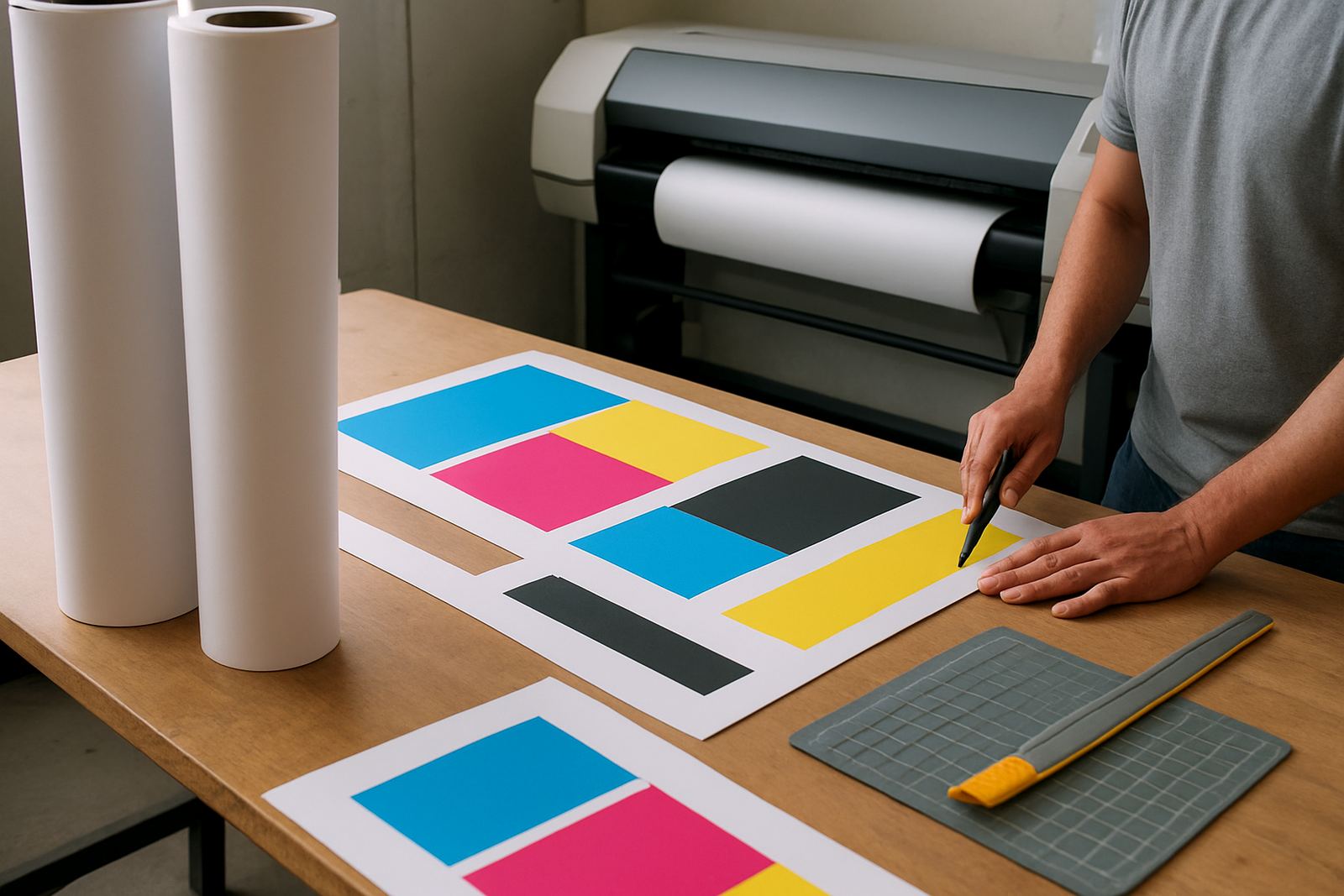
Desktop inkjet colour printers are useful for A4 and A3 posters, test runs and event notices. They are convenient for small teams that need colour without sending every job out. Large-format colour printers make more sense when you need A2, A1 or full signage sheets, or when one design must be repeated across many copies. The printer should suit the paper width, sheet thickness and the kind of ink it uses.
- Use desktop inkjet for short runs, proofs and smaller wall posters.
- Use large-format machines for retail displays, plans and presentation boards.
- Check whether the feed path can handle coated media without slipping.
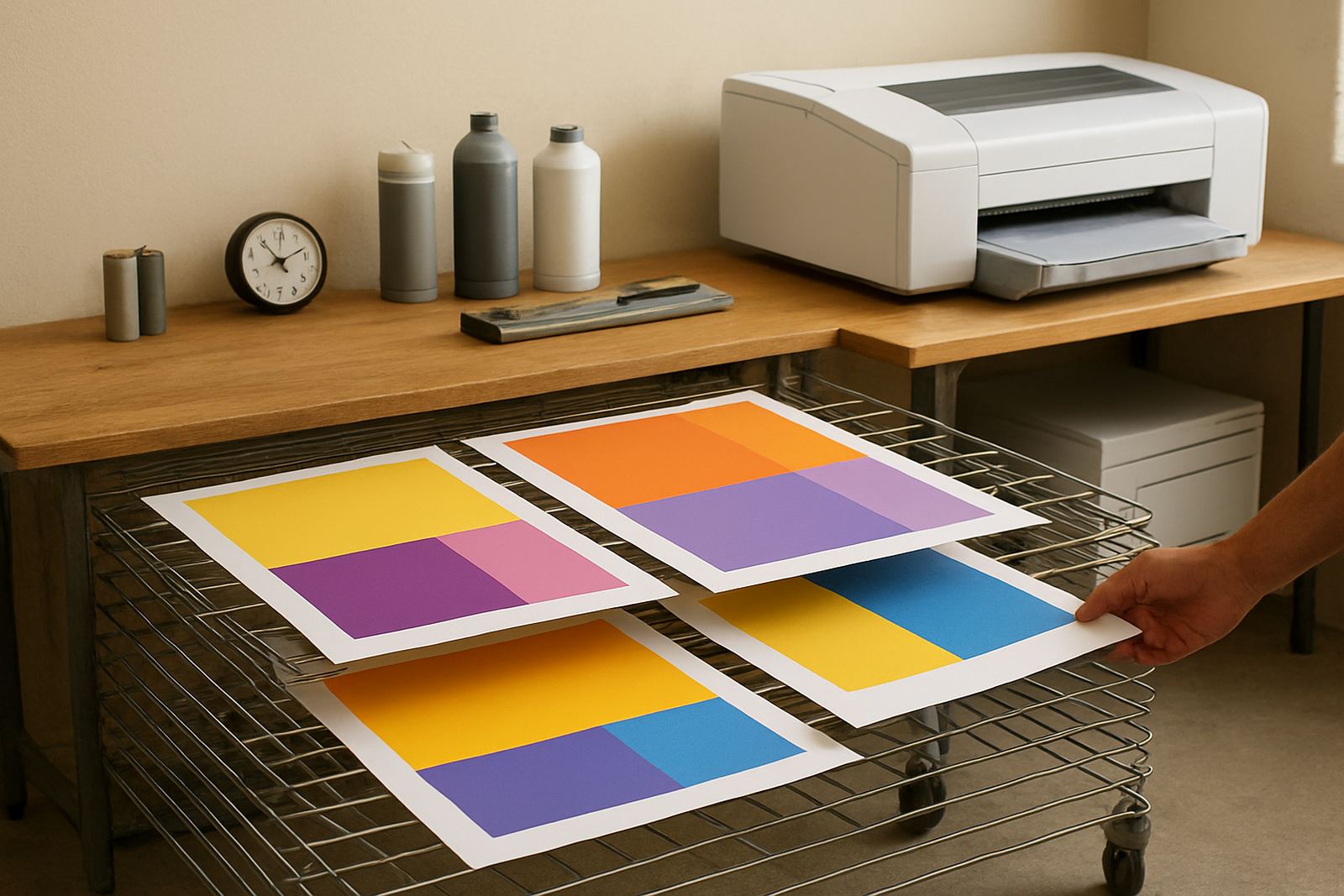
- Ask for practical advice on drying time before stacking or trimming.
If a sign shop in Ndabeni is printing a window promotion for a Somerset West client, the setup needs to handle both speed and finish. A good print result is not only about the machine, it is about the paper feeding cleanly and the ink landing where it should.
3. Ink choice matters more than people think
Poster paper and ink need to work as a pair. Some papers are made for dye ink, others hold pigment better, and some can manage both with different results. Dye ink can give rich colour on the right coated paper, while pigment tends to offer stronger resistance to smudging and light. If the poster will hang near a door or in a sunny spot, that resistance becomes worth paying for.
It also helps to think about how fast the print must be handled. A poster that is cut, mounted and packed straight away needs a paper that dries predictably. If your team works through load-shedding windows and prints in batches when power returns, a paper that does not cockle badly is useful. The goal is simple: fewer reprints, less waste and a cleaner finish for the client.
- Keep the same paper and ink combination for repeat jobs where colour must match.
- Test new media on one sheet before running a full batch.
- Watch for banding, pooling or ink bleed at the edges.
- Keep open reams in a dry cupboard, not next to a damp wall.
4. Finishes that suit South African indoor spaces
Most poster work for offices, schools and showrooms comes down to three finishes: matte, satin and gloss. Matte is easier on the eyes and better where lighting is harsh. Satin gives a neat middle ground, with enough body in the colour but less glare than gloss. Gloss is useful when you want impact on a counter display, though it can reflect too much in bright rooms.
Coastal humidity also plays a role. In places near the sea, paper can take up moisture more quickly, especially if it is stored in a stock room without proper airflow. That is why a poster that looks flat in the morning may curl by afternoon if it is not handled properly. Keep reams sealed until use and leave finished prints to settle before trimming or mounting.
5. A simple way to plan short-run poster stock
Short-run use sounds straightforward, but it is where many teams overspend. A design studio may only need ten copies for client review, while a retail branch may need twenty posters for different stores. The trick is to plan the stock around actual usage, not guesswork. Buying paper that is too light for the job leads to weak presentation, while buying too heavy a stock for temporary notices is money tied up on the shelf.
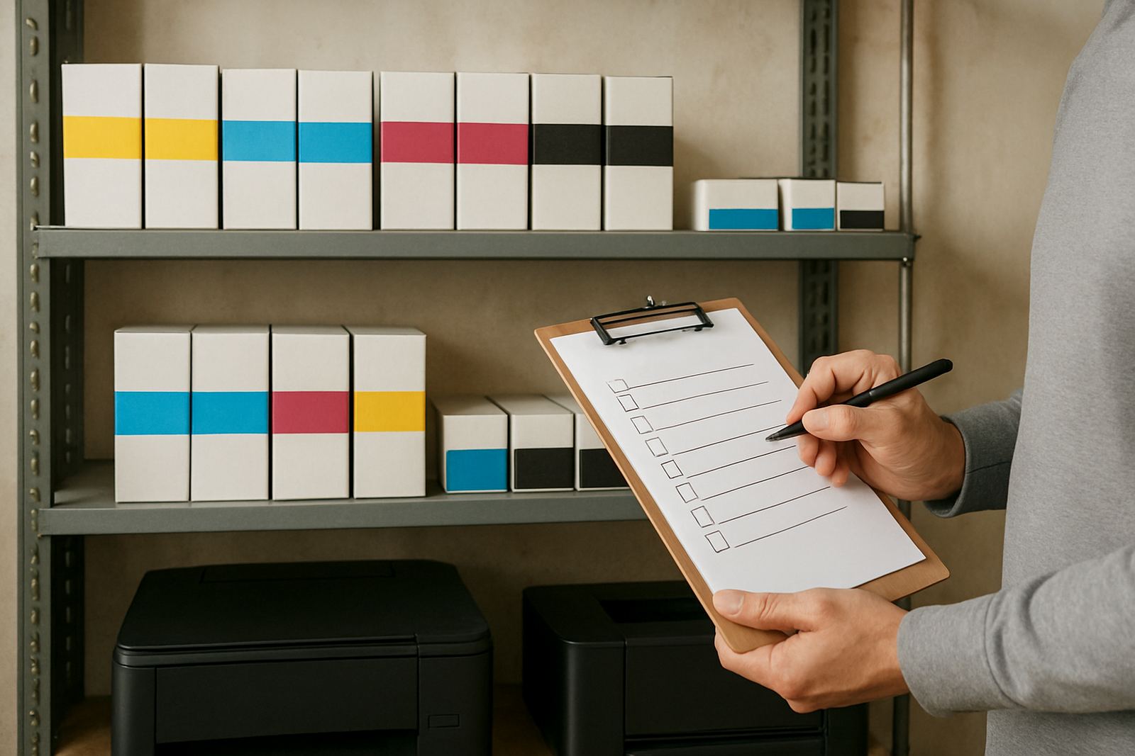
A practical supply plan usually includes the poster sizes you print most often, the ink sets in use and the expected lifespan of each job. That way, reordering is based on metres, sheets and monthly output rather than panic buying when the last pack is opened.
- A4 and A3 for notices, menus and internal messages.
- A2 and larger for retail windows and event boards.
- Extra stock for school terms, month end and seasonal campaigns.
- Backup paper for urgent reprints after transport damage or handling errors.
6. Local handling tips for better results in Cape Town
A Cape Town business working from Ndabeni, Montague Gardens or Woodstock may print the same afternoon and have a poster on site by evening. That is convenient, but it also means handling has to be tight. Do not stack prints before they are dry. Keep cut sheets flat. If a poster must travel to Bellville or Claremont, pack it in a way that prevents scuffing at the corners.
For teams in busy offices, it helps to assign one person to check media type, another to confirm the artwork size, and one more to handle reordering. That small bit of discipline saves a lot of waste. In our experience, the best poster work is not flashy. It is the work that looks clear, stays flat and gets the message across without fuss.
7. When to step up from office colour to wide-format
There comes a point where a standard office printer is no longer the right tool. If your posters need to be larger than A3, if colour blocks are inconsistent, or if you are printing enough copies that downtime starts to matter, wide-format is the better path. It gives you more size options, better control over media and cleaner results for repeated jobs.
That step is often triggered by real work. A sign shop starts with indoor notices, then lands a retail launch or an exhibition job. A design studio begins with proofs, then needs poster boards for a client presentation. Once the volume or size grows, the paper choice matters even more. Matching the printer, ink and media from the start keeps the whole job easier to manage.