Start with the job, not the printer
The easiest way to choose media is to begin with what the print must do. A proof for a client, a poster for a reception area and a daily internal colour sheet all need different paper weights, coatings and handling. If the job is being checked under office lights, for a meeting in Claremont, or for a shop window in Woodstock, the media choice should suit the way people will look at it and how long it must last.
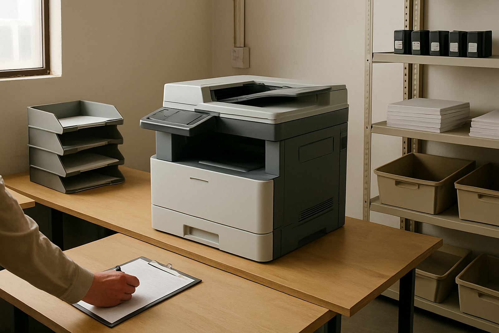
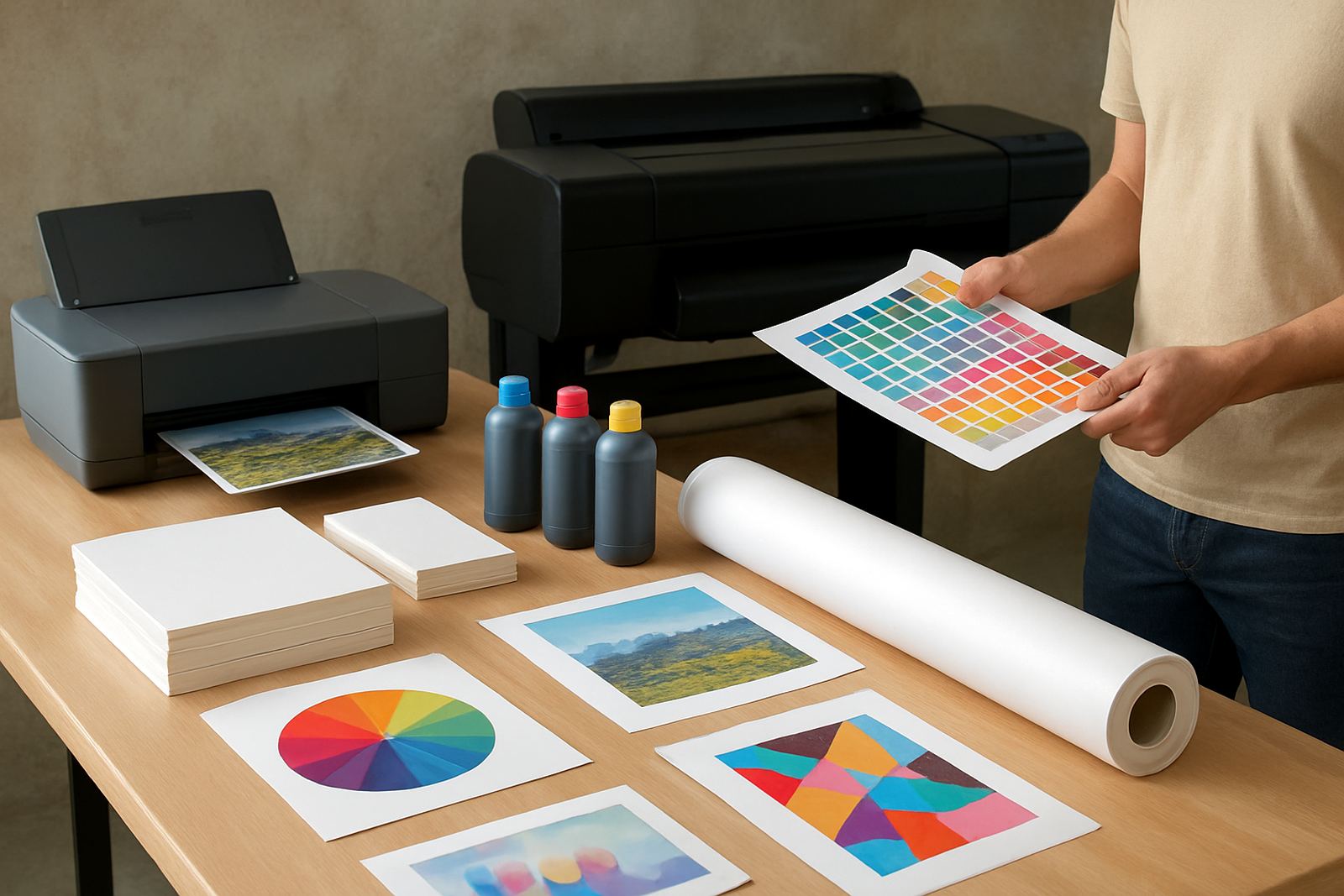
For short runs in a studio or office, plain bond or an everyday matt paper is often enough. It is cost friendly, takes notes well and works neatly for drafts and internal colour. When the job is customer facing, a smoother coated sheet usually gives cleaner text and stronger colour. For posters and sign work, roll media gives better size options and fewer joins.
- Proofs: use coated matt or proofing paper for cleaner colour reads
- Posters: use heavier coated paper or compatible poster stock for firmer flatness
- Daily office colour: use standard colour paper that dries quickly and feeds reliably
- Display work: choose rolls or sheets sized for the final frame or mount
Match paper weight to handling and finish
Paper weight affects more than feel. It changes how a sheet feeds, how flat it lies and how it stands up to packing, pinning and trimming. Light sheets are fine for quick internal use, but they can cockle if too much ink is laid down. Heavier sheets stay flatter and give a better first impression at the handover.
In Cape Town, humidity near the coast can make light paper behave differently from a dry storeroom in Bellville. If your office is near the harbour side or you receive stock that has sat in a warm vehicle, allow the paper to acclimatise before printing. That small step helps reduce curl, misfeeds and edge waviness.
- 80 to 90 gsm: good for office colour and proof notes
- 100 to 120 gsm: a practical step up for sharper looking handouts
- 140 to 170 gsm: better for posters, presentation sheets and mounted work
- Check if the printer can pull the sheet cleanly before you commit to a full run
Coated or uncoated: choose for the image you want
Coated papers control ink spread better, so small type, gradients and logos usually print cleaner. That matters when a design studio in Ndabeni needs a proof that matches client expectations or when a sign shop wants colour blocks to hold their edges. Uncoated papers are easier to write on and can be the better choice for internal notes or forms with colour sections.
If the print will be marked up by hand, uncoated paper is often the practical option. If it must look crisp at a glance, coated matt is usually safer than a glossy finish because it reduces glare under office lighting. Glossy sheets can look strong, but they also show fingerprints and reflections more easily, which is not ideal for everyday use.
- Coated matt: best for proofs, posters and most presentation colour
- Glossy: useful for strong image work but harder to write on
- Uncoated: best for forms, notes and office sheets that need pen marks
Roll media for large-format work and sign jobs
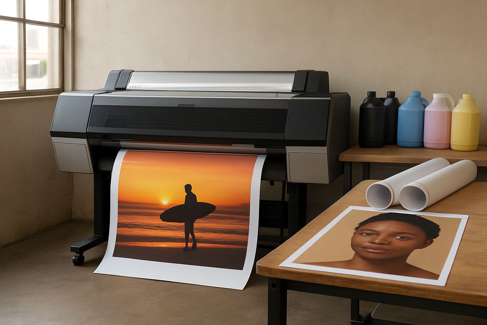
Once a design moves beyond A3 or a small poster, rolls become the sensible choice. They let you print longer pieces, fit common banner sizes and reduce joins. For large-format colour machines, the roll core size, outer diameter and coating type must suit the printer so the media feeds evenly and the print head clears cleanly.
For sign shops in Montague Gardens or Somerset West, roll choice often comes down to the end use. A temporary in-store poster does not need the same stock as an outdoor promotion or a window graphic. If the print will be mounted, laminated or trimmed tight to a shape, choose a roll that stays stable and does not curl badly after printing. That saves time at the cutting table and cuts down on rework.
- Keep at least one everyday roll for quick posters and samples
- Keep a heavier presentation roll for client-facing work
- Confirm roll width before each job so there is less waste
- Store rolls upright and wrapped to keep dust out
Ink, drying and load-shedding planning
Media choice and ink choice go together. A paper that accepts a lot of ink may look great, but if it dries slowly the job can smudge during stacking or trimming. For busy offices and print rooms that run through power cuts, it helps to choose media that dries predictably and to keep the output path clear. If the room gets warm when the power is off, sheets may curl a little more than usual, so print smaller test batches first.
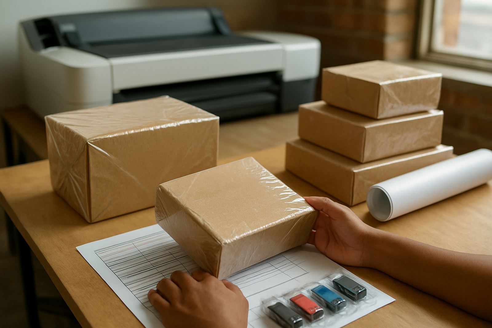
Good planning also means knowing what stock you can keep on hand without tying up too much cash. A slim mix of proof paper, poster stock and one or two roll types usually covers most day to day colour work. That makes reordering simpler and keeps the consumables shelf tidy. It also avoids the common mistake of buying a beautiful paper that no one can feed properly.
- Test a new media with a small print before ordering in bulk
- Check dry time before stacking fresh sheets
- Keep media sealed against dust and coastal damp
- Use a stock list so reordering happens before the last roll is finished
A simple media check before you print
A quick check before printing can prevent a lot of wastage. Look at the sheet size, the coating, the weight and whether the paper has been stored flat. Then run a test strip with the actual file rather than guessing from a generic sample. If the colours are too heavy, too dull or slow to dry, move one step up or down in weight or coating and test again.
For teams in Claremont, Woodstock or Bellville, this kind of routine keeps turnaround steady. It also helps new staff learn why one job goes on coated matt while another goes on plain paper. Over time, the print room starts to behave more predictably and there are fewer last-minute panic reprints.
- Is the media compatible with the printer model in use?
- Does the sheet size match the job with enough trim allowance?
- Will the print need writing space, folding or mounting?
- Is the stock dry, flat and free of dust before loading?
When to ask for help with the choice
If your prints keep curling, smearing or losing colour after a few sheets, the problem is often the media rather than the printer. The same applies when a client proof looks fine on screen but comes out too shiny, too dull or too soft at the edges. That is the point to step back and check the paper type, the ink set and the intended use together.
MyColour helps teams choose paper and roll stock for the job at hand, whether the need is a one-off proof run or a steady flow of posters and office colour. We can help with media matching, ink supply planning, print quality checks and consumable reordering from Ndabeni with courier supply nationwide. For advice, send a message through our contact form and we will help you match the media to the work, not the other way around.
- Printer Installation and User Handover
- Wide-Format Setup and Media Matching
- Preventive Maintenance and Remote Help
- Collection Coordination for service jobs and supplies