A Tokai brief built around presentation boards
The client was an interior design studio in Tokai working on residential and hospitality board packs for meetings in Cape Town and the southern suburbs. Their boards already had good content, but the print finish was not holding up across different papers, different operators and rush jobs near the end of the month. Some sample pages looked too dull, others ran slightly warm, and a few of the heavier presentation sheets were lifting at the edges after print.
The brief was straightforward. Keep the room boards sharp, improve colour consistency, and make sure the studio could print short runs in-house without waiting on a supplier every time a client asked for one more version. They also wanted advice on when to use standard office colour output and when to move to a wider machine for larger layouts or board panels. That mattered because the team was balancing meetings, supplier lead times and the usual Cape Town pressure when a concept has to go out the same day.
What was holding the boards back
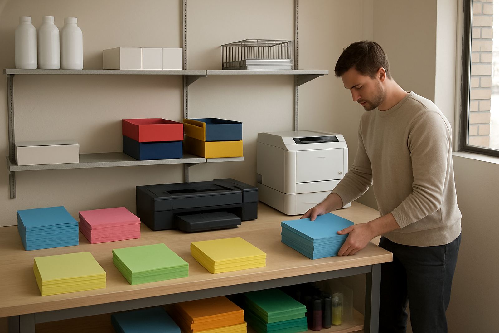
The biggest issue was media mismatch. The studio was using different board stocks for concept boards, client sets and final presentation packs, but the print settings had not been matched to each surface. A satin sheet needs a different ink load to a matte board, and a thicker mount board will feed differently from lighter paper. There were also gaps in the supply routine, so ink was ordered when someone remembered and not before a busy week.
In practical terms, the team needed a print bench that could handle proof work, small presentation runs and the occasional larger format sheet without wasting stock. They also wanted a cleaner handover for staff. If one designer was out, another person had to be able to pick up the job and get the same result. That meant simple settings, a repeatable workflow and enough consumables on hand for normal studio use and the odd after-hours rush.
- Mixed board stocks were producing inconsistent colour and finish
- Short notice reprints were causing delays before meetings
- Ink ordering was reactive instead of planned
- Staff needed a simpler handover for daily print jobs
The setup and supply plan we put in place
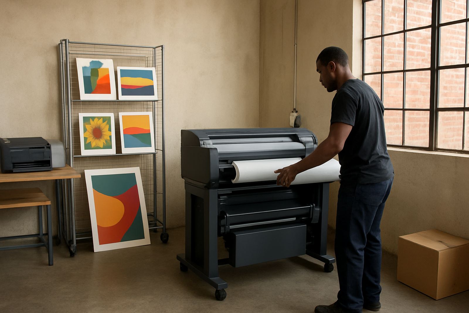
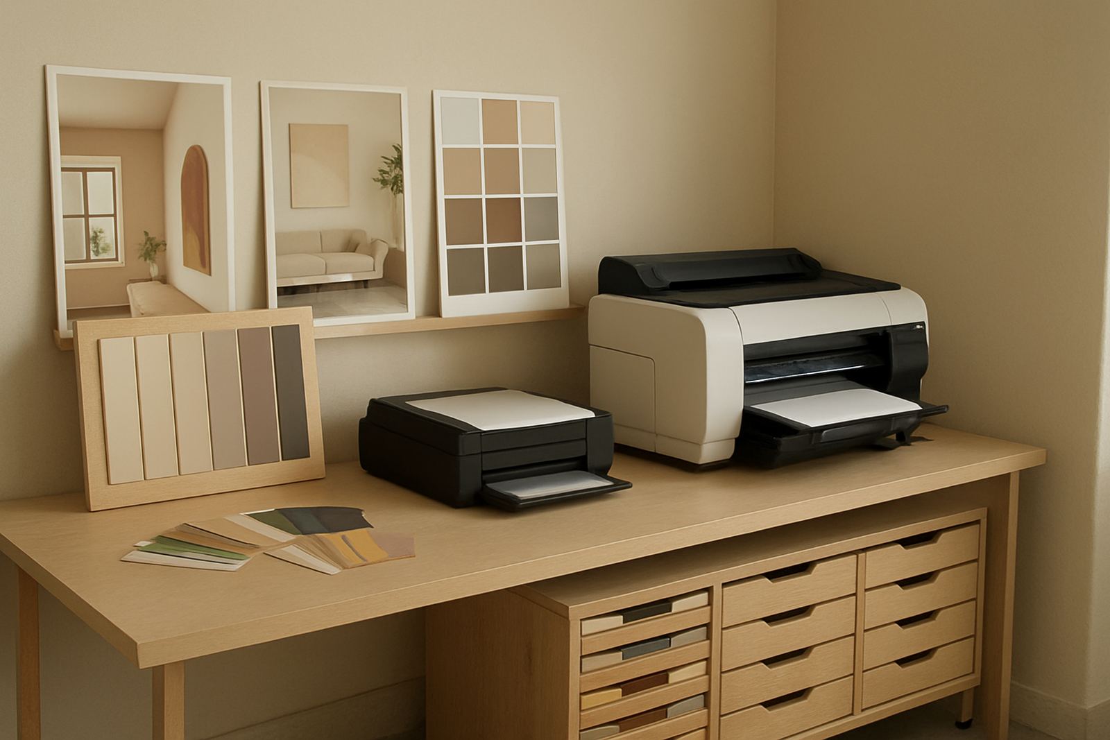
We supplied and set up a colour print solution matched to the studio’s actual output, not just its ideal one. That included a desktop inkjet colour printer for everyday office sheets and proof pages, plus a large-format colour machine for oversized presentation panels and room boards. We then matched ink choices to the media being used, with separate notes for matte presentation stock, heavier board material and lighter proof paper.
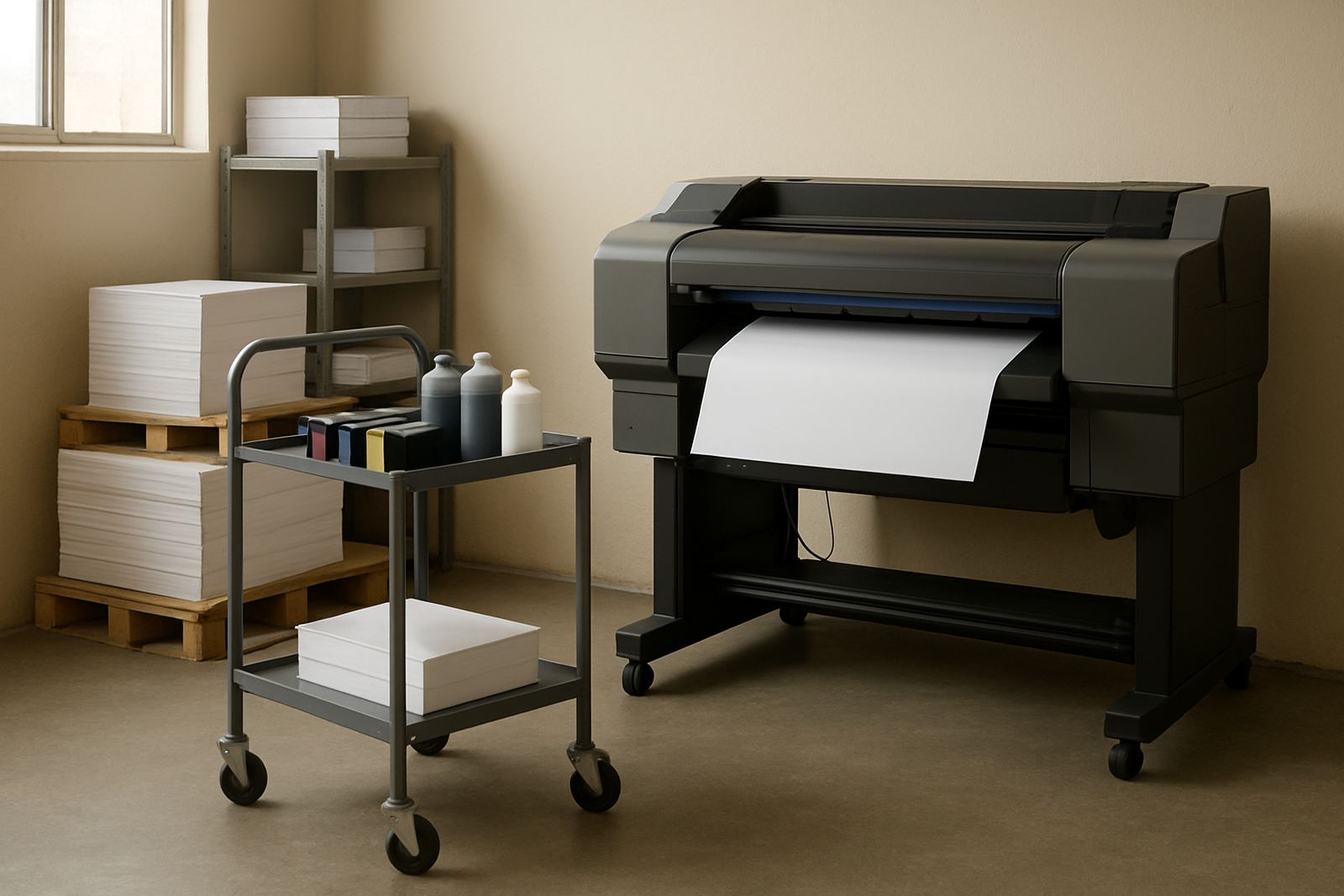
We also set up a practical reordering routine. Instead of waiting for cartridges to run low, the team now keeps a small buffer of the core colours in hand and tracks usage by project type. That buffer makes a real difference in Cape Town when the wind picks up, courier timing slips, or a board has to be reprinted after a client round of comments. The service package covered printer installation, wide-format setup, media matching, print quality checks and user handover. If something changed on the design side, we could talk the studio through it remotely or arrange collection and return coordination where needed.
- Desktop colour printer for proofs, internal sheets and office colour work
- Large-format colour printer for boards, posters and room presentation panels
- Matched inks for each approved media type
- Simple consumable reorder plan with a small safety stock
Timeline from first test to live board output
The project ran over four weeks from first review to stable in-house printing. Week one was a site review and sample collection, followed by a check of current papers, board finishes and the types of files the studio was sending to print. Week two focused on setup, installation and a series of test prints across the main stock types. We adjusted colour profiles, feed settings and drying time between each pass so the boards would stack neatly and not mark in transit.
By week three the team was producing client boards with far less trial and error. We reviewed a few real projects, made small changes to ink load and media handling, then locked in the settings for the most common output sizes. In week four we completed the handover, covered basic maintenance and showed the staff how to spot early signs of nozzle issues, feed wear and colour drift before those problems affected a deadline.
Results the studio could see on the wall
The result was a cleaner, more dependable board presentation process. Colours on the room boards were closer to the intended material palette, whites stayed cleaner and the final packs looked more consistent from one job to the next. The studio also cut down on wasted sheets because they were no longer testing blindly on the wrong media. That saved time and gave the designers more confidence when they sent a client pack out for approval.
Just as important, the team had a better sense of what each printer should be used for. Everyday office colour work stayed on the compact machine, while larger presentation work moved to wide-format output. That split kept the workflow clearer and reduced unnecessary wear on the smaller device. The studio now has a more predictable path from concept board to final client pack, with fewer last minute surprises and better control over consumables.
- More consistent colour across repeated board sets
- Less waste from trial prints on the wrong stock
- Faster turnarounds on reprints and small changes
- Clearer use of desktop versus wide-format output
What we would carry into a similar interior project
If we were setting up another interior design team in Tokai, Claremont or Somerset West, we would follow the same approach. Start with the actual board stocks, not the theory. Check the file types, the size of the working space and the number of people who will touch the printer. Then build the print setup around those facts. That usually gives a better result than buying a machine first and hoping the media will behave itself.
We would also keep the consumable plan simple from day one. A small colour buffer, basic maintenance checks and one person responsible for reordering makes a real difference when a project is due and the studio is busy. For design teams working under municipal deadlines, client review cycles or late afternoon courier cut-offs, that kind of planning is worth more than fancy specifications on a brochure. It keeps the boards moving and the work looking professional.
Cape Town support with nationwide supply
MyColour works from Ndabeni, Cape Town and supplies colour printers and matching inks nationwide by courier. We support studios, sign shops and office teams across Montague Gardens, Woodstock, Claremont, Bellville and Somerset West, with practical help that covers installation, maintenance, quality checks and consumable reordering. For teams dealing with load-shedding, humid coastal conditions or regular reprints, the aim is simple: steady output and fewer interruptions.
For interior board work, poster sets and day-to-day colour printing, the right mix of machine, media and ink matters more than any single item on its own. This Tokai project showed that clearly. Once the setup matched the job, the studio could focus on design instead of fighting the printer. That is the kind of result we aim for every time.
Key facts
| Project town | Tokai, Cape Town |
|---|---|
| Client type | Interior design studio |
| Timeline | 4 weeks |
| Print setup | Desktop inkjet colour printer plus large-format colour machine |
| Key service | Media matching for room boards and presentation packs |
| Primary outcome | More consistent colour and faster board turnaround |