What draft mode is good for in a busy print room
Draft mode is useful when the page is still being checked and no one is paying for final output yet. For design studios, sign shops and offices in Cape Town and beyond, it is a quick way to see if the layout works, if the wording is correct, and whether the file will hold together on paper before you commit to a proper run.
In plain terms, draft mode reduces ink coverage and often lowers print quality settings so the printer can move faster. That is helpful for internal notes, colour roughs, job tickets, and approval copies where the main aim is to spot mistakes early. It can also help when power interruptions or load-shedding mean you need to get a quick check out of the machine before the next outage.
Used properly, draft mode saves more than ink. It saves time on the printer, saves paper on fixes, and saves your team from standing at the machine wondering why a full-quality print was sent out for something that was never final.
Where draft output starts to cost more than it saves
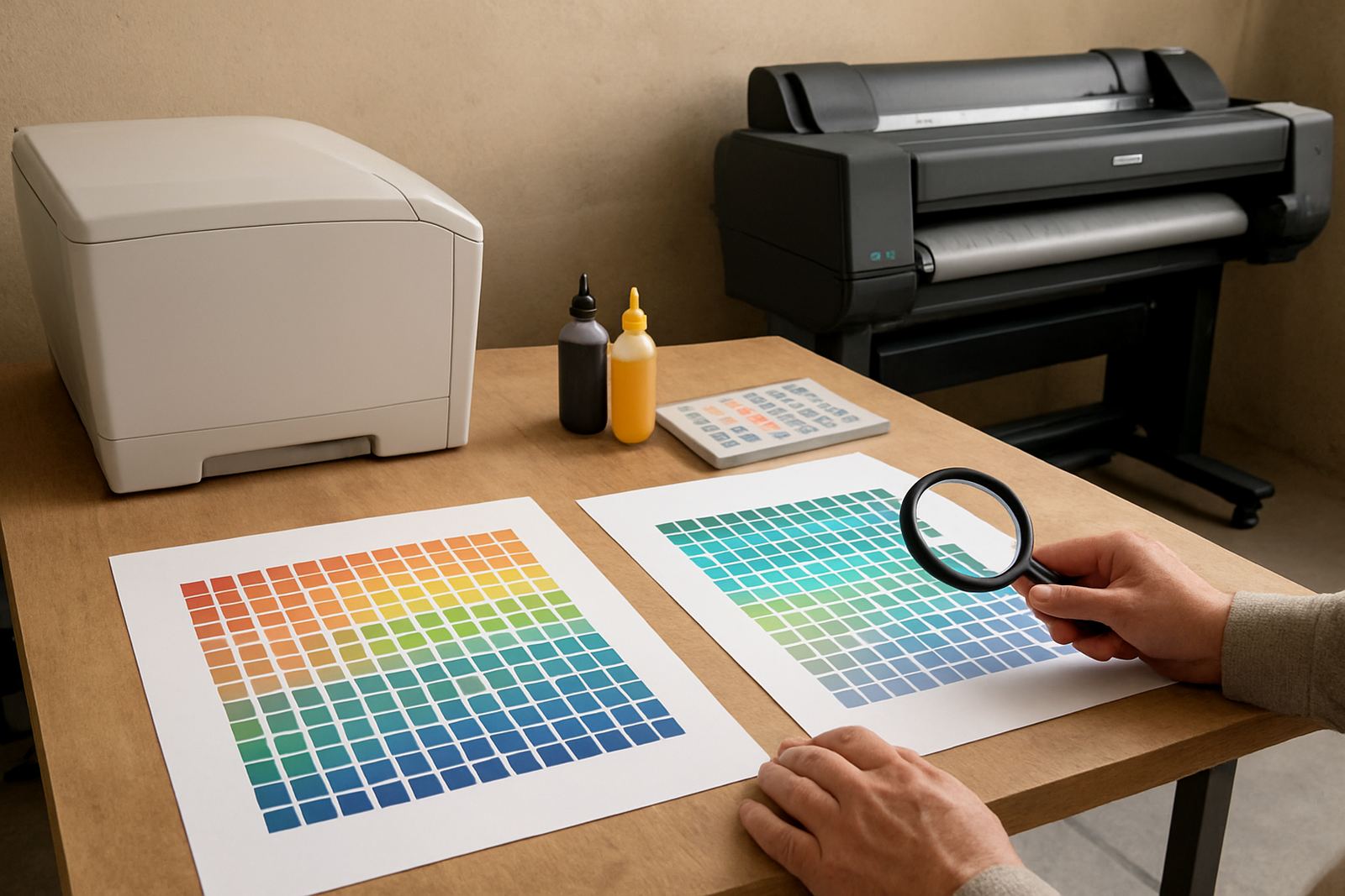
Draft mode becomes expensive the moment someone treats it like a near-final proof. Faint colour, banding, thin lines and muddy blacks can make a page look acceptable at first glance, but once it is handed to a client or manager, it may come straight back for reprint. That second run is where the real cost sits.
There are a few common traps:
- Colour-critical proofs printed in draft mode, where brand colours must be checked properly.
- Artwork with fine text, hairlines or technical notes that become unreadable on a low setting.
- Customer-facing samples for signage, posters or presentation boards that need to show true colour and contrast.
- Jobs printed on the wrong media, then blamed on the printer instead of the setting.
If a client signs off from a weak print, you may still have to explain why the final version looks different. That kind of misunderstanding causes more delay than the ink ever saved. For any job where accuracy matters, use a proper print quality setting and the right paper or film from the start.
A simple rule for choosing draft, proof or final print
A practical rule helps staff make the call quickly. Use draft for checking. Use proof for approval. Use final for delivery. If a team member cannot say which of those three stages the file is at, the printer is probably set too low or too high for the work at hand.
In many offices, the problem is not the printer it is the habit. Someone sends every message attachment in draft mode because it feels economical, then the marketing team asks why the logo looks washed out. Another person prints every internal memo in the highest setting, which wastes colour and slows the queue. The middle ground is to match the setting to the purpose.
- Draft: internal checking, line edits, pagination, quick layout review.
- Proof: client approval, colour comparison, layout sign-off.
- Final: delivery copies, presentations, signage work and anything that leaves the building.
That simple split works well in shared print rooms, especially where several departments use the same machine. It also makes consumable planning easier because everyone is not burning through inks at the same rate.
Why media choice matters just as much as print mode
Draft mode is often blamed for poor results, but the paper or film underneath can be just as important. Cheap copy paper soaks up ink unevenly, which makes draft prints look patchy and hard to read. In Cape Town, where coastal humidity can curl lighter stock, that problem shows up even faster. A file that looked acceptable on a dry morning can appear softer by the afternoon.
For design proofs, use media that suits the job. For plain office checking, an everyday bond sheet is usually fine. For posters, graphics, or colour samples, a better coated sheet can show tone and detail more accurately. If the print is for signage, ask whether the file should be checked on the actual material or on a matching proof stock first.
Matching the media to the purpose means fewer surprises and fewer reprints. It also helps the team understand whether a problem is with the file, the ink, or simply the wrong substrate. That distinction matters when you are trying to keep a print room moving during a busy week in Ndabeni or Montague Gardens.
A Cape Town example from proof to final output
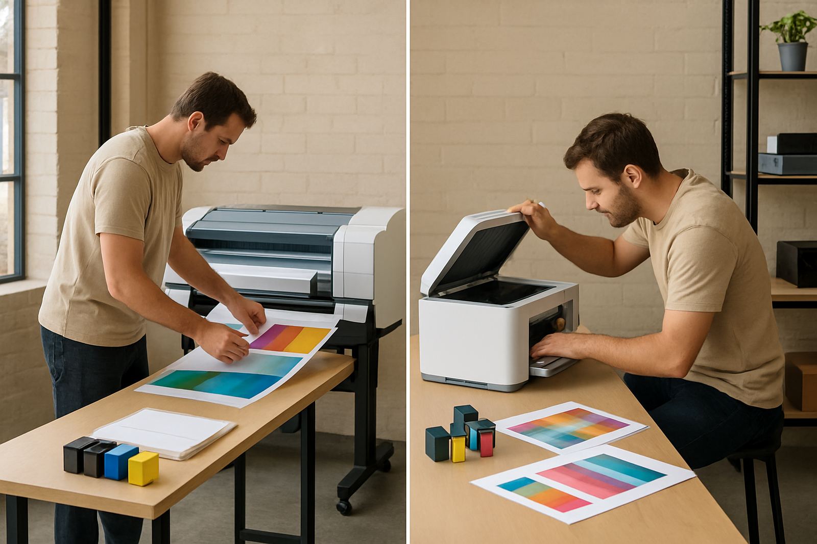
A small sign shop in Ndabeni may use draft mode all morning for internal layout checks, then switch to a proper proof for a retail client in Claremont who wants to approve colours before a larger run. That is sensible. The problem comes when the first draft is shown to the client as though it is final, especially if the printer is using a lighter ink laydown to save consumables.
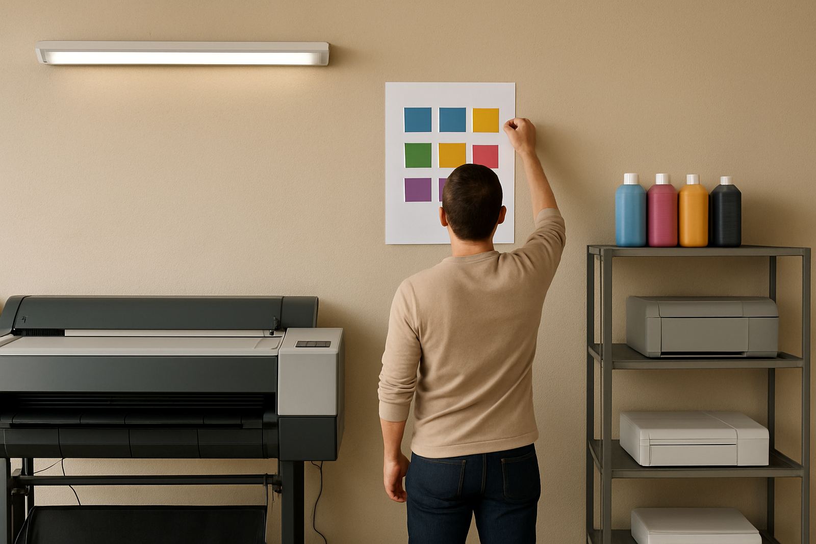
Say the job is a set of window graphics for a Somerset West shop. The team prints a draft on office paper and sees the text is aligned, but the blue brand block looks pale. If they send that copy to the client as a colour reference, the client may reject the final print even though the artwork was correct. The better route is to use a proof setting on suitable media, confirm the tones, then print the final output once approved.
That process also helps when couriering jobs nationwide. If a studio in Woodstock approves a weak proof and the final goods go out to another province, a colour mismatch becomes a costly return. Better to spend a few extra Rand on the right check copy than to ship a whole order twice.
How to keep draft mode useful without causing waste
The best print rooms set a few clear habits and stick to them. The printer should not be a guessing game, and staff should know when to touch the draft button and when not to. A short user handover after installation can save a lot of confusion later, especially where several people share one machine.
- Label the default settings for draft, proof and final output.
- Keep a note near the machine showing which media suits each stage.
- Review colour work before it leaves the room, not after.
- Plan ink reordering based on real usage, not only on spare bottles in a cupboard.
- Book preventive maintenance before quality starts slipping and the team starts compensating with higher settings.
Remote help can sort many setting issues quickly, but the everyday discipline still matters. If the wrong mode keeps being used, the problem is usually workflow rather than hardware. A printer that is looked after, set correctly and matched to the job will give steadier results and fewer complaints from clients.
When it is time to step up to wide-format printing
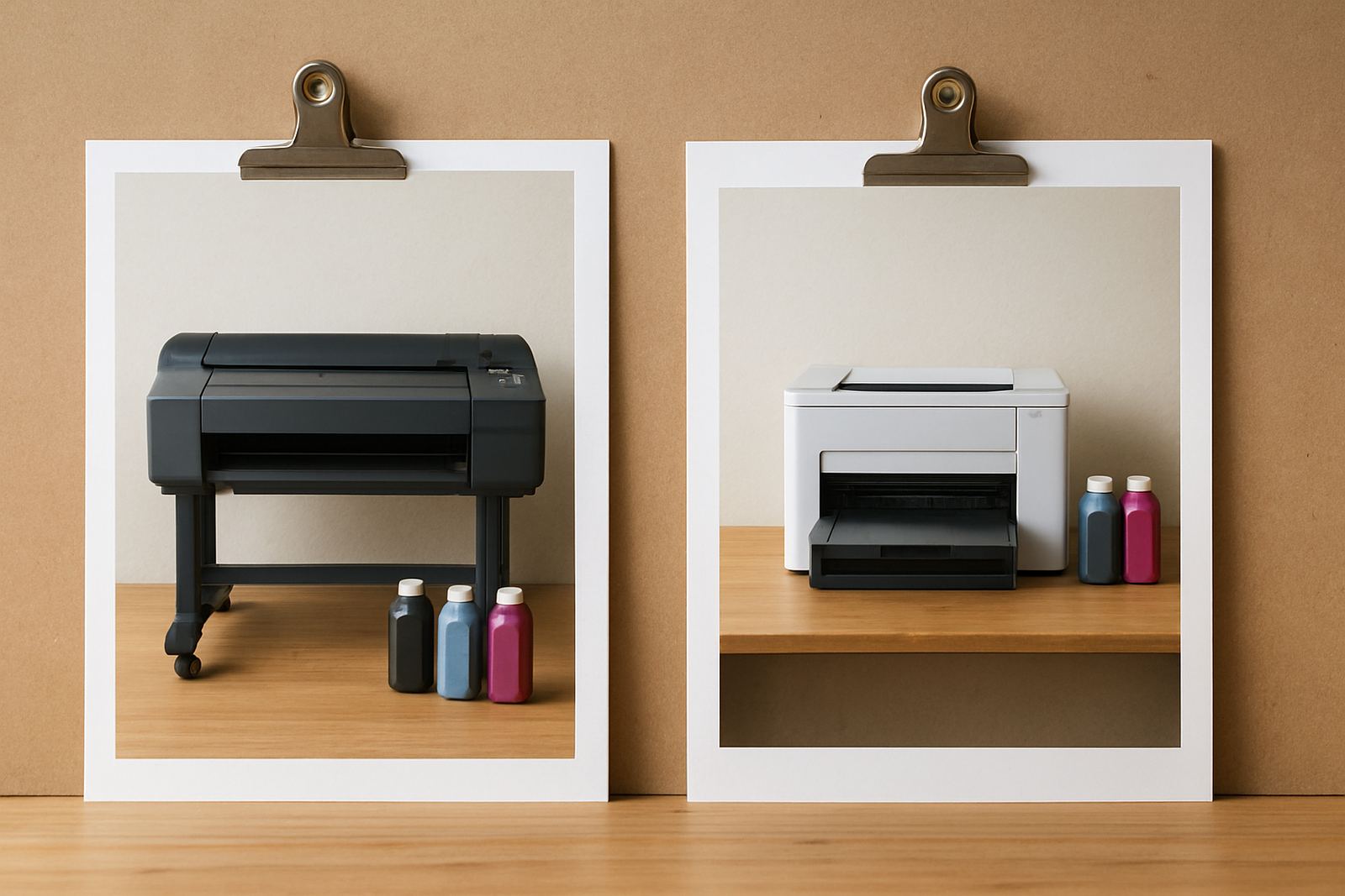
There comes a point where draft output simply cannot carry the job. If the work is poster-sized, trade-show related, or needs to be viewed from a distance, the office printer is the wrong tool. That is when wide-format machines make more sense, especially for sign shops and studios handling larger colour pieces every week.
Draft mode has a role, but it is not a shortcut for every stage of production. Use it to check ideas, confirm wording and catch errors early. Then move to the right print quality, the right media and the right machine for the final result. That is how teams avoid the kind of reprints that eat time, ink and patience.
For South African businesses working under tight deadlines, the real saving is not the cheapest page, it is the fewest mistakes. That is where a practical print setup pays for itself.