Why the proof sheet changes what your eye sees
A colour proof is not only about whether the file prints. It is about how the ink sits on the sheet, how light bounces off the surface and whether text, images and blocks of colour read the way they should before production starts.
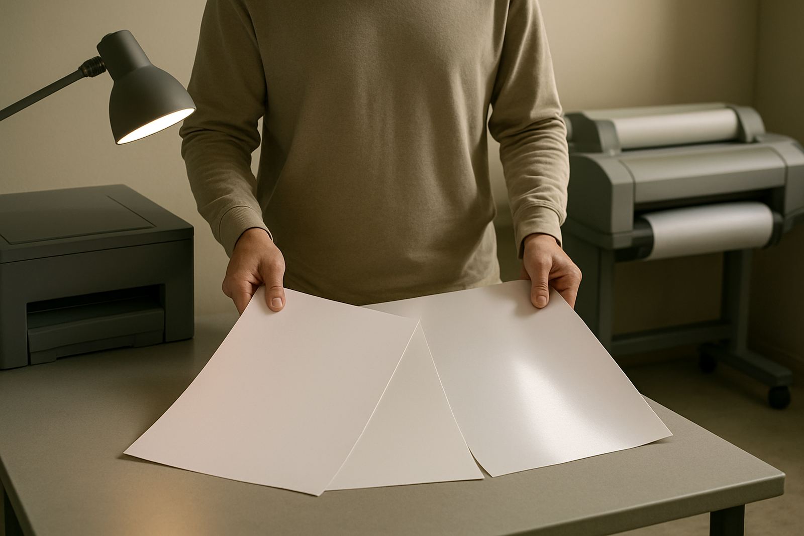
On a coated sheet, colour often looks deeper and sharper because the ink dries on the surface. On an uncoated sheet, the same file can appear softer, slightly warmer and less contrasty. That is not a printing fault, it is the paper doing its job. If a client is signing off a brand colour, a fold line, or a poster layout, the sheet should match the final use as closely as possible.
In Cape Town, where many studios and sign teams work between the city, Ndabeni and Montague Gardens, we see this most often on proof runs that are meant for both office review and production approval. One proof on the wrong paper can send a team back for a second round and that costs time, ink and patience.
Match the finish to the decision you need to make
The finish should answer the question in front of you. If the team is checking image tone and rich colour, a smooth coated proof sheet gives a more realistic view of saturation and shadow detail. If the question is readability, pagination and whether dark text holds on a lighter stock, an uncoated or matte sheet may be the better call.
- Use matte or uncoated paper for layout, typography and text-heavy approvals.
- Use coated paper for image-heavy work, brand colours and poster artwork.
- Use the same weight and finish as the final stock where possible.
- Keep one proof paper per workflow so staff do not mix up review standards.
For busy offices in Bellville or Somerset West, the right sheet also helps with internal sign-off. A finance manager reviewing a brochure does not need a high-gloss finish that distracts from copy changes. A design lead checking a local event poster does need enough surface smoothness to judge gradients and solid colour blocks properly.
Why uncoated paper can be the honest choice
Uncoated paper is often the most honest proofing surface when the final job is a booklet, letterhead, form or internal document. It reflects less light, so you see type spacing, line weight and contrast without shiny distractions. It also gives a better sense of how softer stock will absorb ink in the final run.
That matters when the job is going to a municipal notice board, a training pack, or a customer-facing form that needs easy reading under office lighting. On a low-cost smooth sheet, a proof may look cleaner than the final print. On a proper proof sheet, the team can spot whether a grey box is too light or if small text will fill in once printed in volume.
- Choose uncoated proof sheets for forms, manuals and admin packs.
- Check small text at actual size, not zoomed on screen.
- Watch for dark solids that may dry differently on absorbent stock.
- Keep an eye on paper curl in humid coastal conditions, especially in summer.
If your studio is near the harbour or working from a space with aircon that switches on and off, paper moisture can shift through the day. A slightly humid room in Woodstock or Claremont can make sheets behave differently by the afternoon, so keep proof paper sealed until use.
Gloss, satin and matte each tell a different story
Gloss papers produce the strongest colour pop, but they can also hide detail in bright office light. A proof that looks excellent under one lamp may be harder to read under another. Satin and silk finishes sit in the middle, giving good colour response with less glare. Matte keeps reflections low and is often the safest option for meetings where people stand around a table and compare pages from different angles.
When a sign shop in Ndabeni is checking a poster series, a satin proof can help balance both colour and legibility. If the final output is likely to be seen in a shopfront window, on a wall display, or under mixed daylight and fluorescent light, the proof should account for that viewing condition. The point is not to make the proof look fancy, it is to make it truthful.
Teams often ask why one client prefers matte while another insists on gloss. The answer is usually context. A luxury product image wants shine and depth. A price list or training chart wants calm readability. Paper finish decides which side of the job you are really checking.
Local proofing problems we see in Cape Town
In Cape Town, proofing issues are often practical rather than technical. Load-shedding can leave paper sitting near a window or open packing area for longer than planned, which changes moisture and flatness. Coastal air can affect sheet stability. And when a job is moving between offices in Claremont, Bellville and Ndabeni, the proof may be handled more than once before final approval.
A common case is a design studio printing a brochure proof on standard office paper because the right stock was not on hand. The images look flat, the blacks do not hold and the client thinks the printer is at fault. Then the same file goes onto a coated proof sheet and the colour comes right into line. That small paper change saves hours of argument.
- Store proof stock flat and sealed, away from sunlight.
- Let paper acclimatise for a few hours before important print runs.
- Keep proof paper separate from everyday copier stock.
- Use the same room lighting for every sign-off meeting where possible.
For shops handling courier work nationwide from Ndabeni, consistency matters too. If a proof approved in Cape Town must match a production run sent elsewhere, the paper choice should be documented with the file notes and media details.
A simple paper rule for better sign-off
The easiest rule is this: the proof paper should be close to the final use, and clean enough to show the real job without distraction. If the final item will be smooth and coated, proof on smooth and coated. If it will be everyday office print, proof on a sheet that behaves like office stock. If you are still deciding, start with the finish that best answers the client’s main question.
That approach helps teams avoid false confidence. It also keeps ink use sensible, because fewer reprints are needed when the first proof is honest. For a print team balancing posters, branded stationery and day to day colour work, that discipline makes the whole bench more reliable. Not perfect, but much closer.
MyColour works with design studios, sign shops and offices that need practical guidance on paper choice, ink selection and the shift from office colour to wide-format. The right paper for proofs is often the simplest way to get a better answer first time.