
Why the same print can look different across the room
Colour does not only depend on ink, media and file setup. It also depends on the light falling on the print. A soft white office fitting, a cool LED strip, daylight from a north-facing window in Cape Town, and the mixed light in a loading bay will all change how the eye reads a proof. That is why two people can stand over the same sheet and disagree, even when the print is technically fine.
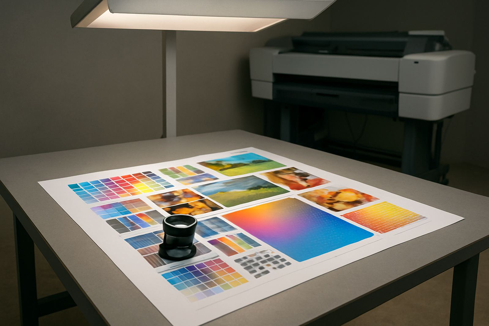
In a proofing room, the aim is simple: create a controlled place where everyone judges colour under the same conditions. If a design studio in Ndabeni checks one client sample under bright daylight and another under warm indoor light, the results will shift. Skin tones, blacks, greys, brand colours and light tints are usually the first to move.
What good viewing light does for everyday print decisions
Good viewing light helps staff answer the practical questions before a run goes out. Is the blue too purple? Does the black text sit clean on the stock? Are the pastel panels too dull for the client? Is that coated paper showing a slight colour cast? In a busy office, these checks save reprints and awkward calls later.
- It reduces arguments during sign-off because everyone looks at the sample under the same light.
- It helps catch paper and ink mismatches before a full job is printed.
- It makes it easier to compare a proof to previous work or a brand reference sample.
- It supports more consistent work when staff rotate shifts or work load-shedding hours.
For sign shops and studios that switch between proofing and production through the day, this matters even more. A job checked under one lighting condition and installed under another can surprise a client on site.
Set up a simple proofing area without overcomplicating it
You do not need a fancy room to start. A clean corner with controlled light, neutral walls and a stable surface can already improve decisions. Keep the viewing area away from direct sun, coloured wall paint, glass doors and strong reflections from glossy tables. In summer, coastal glare and afternoon heat can also make a room harder to read accurately.
Use light that stays consistent through the day and avoid mixing too many different sources in the same space. If the room has a window, fit blinds or use the area away from the glass. Keep the surface around the proof neutral so the eye is not tricked by bright colours nearby. Even a red chair or blue sample folder close to the print can influence judgement.
- Choose a neutral wall and table finish.
- Keep the room free of bright posters and coloured objects.
- Use the same light source every time you check samples.
- Let prints rest before final judgement, especially after heavy ink coverage.
Match lighting to the job, not only to the room
Different print work calls for different levels of scrutiny. A quick office flyer does not need the same viewing discipline as a brand colour proof, but both still benefit from steady light. For a sign shop in Montague Gardens, the priority might be repeatable colour across stickers, posters and panels. For a Claremont office, it might be proofing a brochure where image tone and text sharpness must both look right.
When a print is going to live outdoors, view it in a way that gives a fair sense of how it will hold up in real use. Indoor proofing light should still be controlled, but your team also needs to think about where the job will be seen. A sample checked under dim yellow light may pass in the room and then look flat in a bright foyer or retail window.
In practical terms, the goal is not to make every colour perfect under every lamp. It is to choose one reliable standard for approval and stick to it. That is the simplest way to keep production honest.
Common mistakes that throw off colour judgement
Most print problems blamed on the machine start with poor viewing conditions. If the light changes from morning to afternoon, or if a sample is checked in a reception area one minute and next to a sunny window the next, the result will feel inconsistent even when the printer is doing its work properly.
- Checking proofs under mixed light sources.
- Holding samples too close to coloured walls or screens.
- Comparing wet prints to dry reference sheets.
- Using one room for storage, packing and viewing at the same time.
- Rushing a client sign-off before the print has settled.
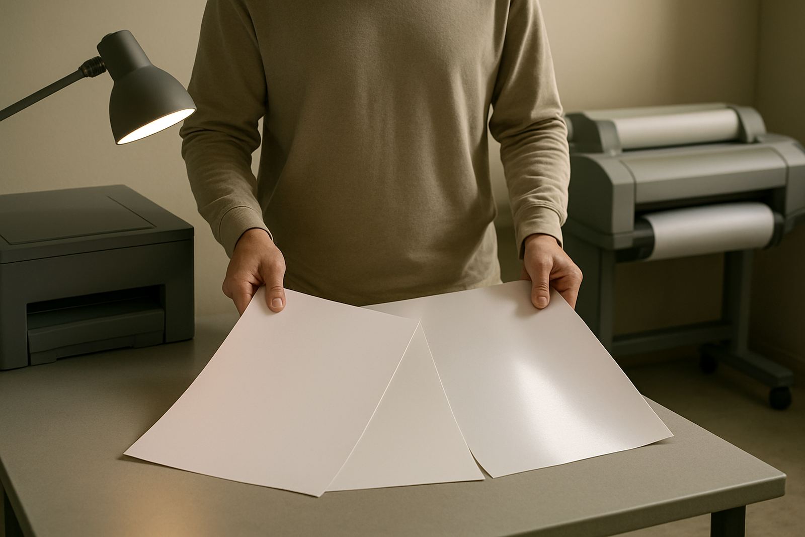
Another common problem is ignoring the paper itself. Uncoated stocks, coated stocks and textured media all reflect light differently. A pale cream stock may make a clean grey look warmer than expected. If the team does not notice the stock effect, they may chase a colour shift that is really only a viewing issue.
A Cape Town example from a busy print floor
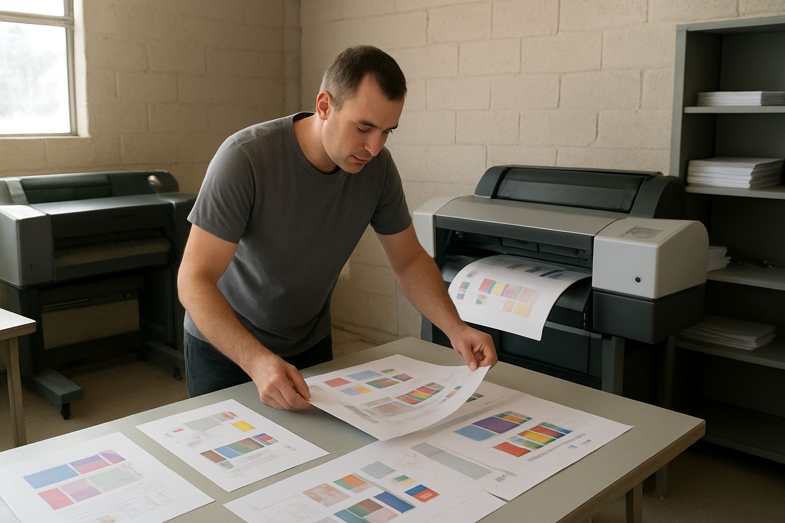
In Ndabeni, a studio might print a presentation board in the morning and a set of retail samples after lunch. The first check happens near a window while the second is reviewed under office LEDs. The client says the second proof looks slightly cooler, and the team starts adjusting the file. But the real difference is the light, not the machine.
This is why a local print team needs a repeatable habit. Keep a fixed checking point in the room, use the same lighting every time, and note the stock used. If a job will be collected from Montague Gardens or sent courier to Somerset West, the sign-off should happen under the same conditions each time. That saves time, paper and fuel, and it cuts down on back-and-forth after delivery.
For businesses working through load-shedding, a stable proofing area becomes even more important. When lights come back on, the room should still read the same way, not shift because emergency fittings are too harsh or too warm.
A practical routine for keeping proofing light under control
Simple habits usually work better than elaborate systems. Train staff to view samples in one place, at one time of day if possible, and under the same conditions. Keep a note of the stock, printer settings and ink set used for each approved sample. When a client returns after a week, you want the same proofing method ready, not a new guess based on where the sheet landed on the counter.
- Pick one proofing spot and keep it free of clutter.
- Use a repeatable light source for all approvals.
- Store reference samples flat and away from direct sun.
- Record media type, date and print settings with each approved job.
That kind of discipline suits the way South African print businesses actually work. It is practical, not fussy. And when a design studio, sign shop or office can trust its viewing light, it can trust the proof a lot more.